

Search has become a mobile-first experience. Whether someone is looking for a nearby restaurant, comparing product prices, reading reviews, or asking a quick question, the journey often begins on a smartphone. That shift has changed how search engines evaluate websites, making mobile SEO one of the most important factors in modern digital visibility.
TLDR: Mobile SEO affects rankings because search engines prioritize websites that work well on smartphones. Fast loading times, responsive design, easy navigation, and helpful mobile content all influence how pages perform in mobile search results. If your site is difficult to use on a phone, it may rank lower even if the desktop version looks excellent.
Why Mobile Search Results Matter
Mobile search results are not just smaller versions of desktop results. They are shaped by user intent, location, screen size, speed expectations, and search behavior. A person searching on a phone usually wants quick, practical, and easy-to-access information. Search engines understand this and reward websites that deliver a better mobile experience.
For businesses, publishers, and online stores, this means mobile SEO is no longer optional. A site that loads slowly, has tiny text, or forces users to pinch and zoom can lose visitors quickly. High bounce rates and poor engagement may signal that the page is not satisfying users, which can affect rankings over time.

Mobile First Indexing: The Foundation of Mobile SEO
One of the biggest changes in search ranking is mobile first indexing. This means search engines primarily use the mobile version of a website’s content for indexing and ranking. In other words, your mobile site is not a secondary version anymore; it is the main version search engines evaluate.
If your desktop site has detailed content but your mobile version hides important text, links, images, or structured data, your rankings may suffer. Search engines need to see the same valuable information on mobile that users can access on desktop. Consistency between versions is essential.
Responsive design is often the best approach because it allows the same page to adapt to different screen sizes. Instead of maintaining separate desktop and mobile URLs, a responsive site delivers a unified experience across devices.
Page Speed and Mobile Rankings
Speed is one of the most visible ways mobile SEO affects rankings. Mobile users are impatient, especially when they are searching on slower connections or switching between apps. If a page takes too long to load, many visitors leave before they see the content.
Search engines consider page experience signals, and loading performance is part of that picture. A fast mobile site improves user satisfaction, increases engagement, and can help rankings. A slow site, even with strong content, may struggle to compete.
Important speed improvements include:
- Compressing images so they load quickly without losing too much quality.
- Reducing unnecessary scripts that delay page rendering.
- Using browser caching to help repeat visitors load pages faster.
- Minimizing code such as CSS, JavaScript, and HTML.
- Choosing reliable hosting that can handle traffic efficiently.
Speed is especially important for e-commerce sites. A delay of just a few seconds can reduce conversions, increase cart abandonment, and weaken the overall performance of paid and organic traffic.
User Experience on Small Screens
Mobile SEO is not only technical. It is also about design and usability. A page might contain excellent information, but if users cannot read it comfortably or tap buttons easily, the experience becomes frustrating.
Good mobile user experience includes readable font sizes, clear spacing, simple menus, and buttons large enough for fingers. Pop-ups should be used carefully because intrusive interstitials can block content and annoy visitors. Search engines want users to reach the information they requested quickly.

Navigation should also be straightforward. Mobile visitors do not want to dig through complicated menus. A clean structure, visible search function, and logical internal links help users find what they need. These improvements can lead to longer visits, more page views, and better engagement signals.
Content Must Match Mobile Intent
People search differently on mobile. They often use shorter queries, voice search, and location-based phrases such as near me, open now, or best nearby. Mobile SEO should account for these behaviors.
Content that performs well in mobile search is usually clear, direct, and easy to scan. Long blocks of text can feel overwhelming on a small screen, so use headings, short paragraphs, bullet lists, and concise answers. This does not mean content should be shallow. It means information should be organized in a way that respects the mobile reader’s attention.
For example, a page answering a common question should provide a quick answer near the top, followed by deeper explanation. This format is helpful for users and can also improve the chances of appearing in featured snippets or other enhanced search features.
Local SEO and Mobile Search
Mobile search is strongly connected to local intent. Many users search while they are on the move, looking for directions, store hours, phone numbers, reviews, or nearby services. That is why local SEO and mobile SEO work closely together.
To improve local mobile visibility, businesses should keep their contact information accurate and consistent. This includes the business name, address, phone number, hours, and website URL. A complete local profile can increase the likelihood of appearing in map results and local packs.
Reviews also play a major role. Mobile users often compare businesses quickly, and positive reviews can influence both clicks and conversions. Encouraging satisfied customers to leave honest reviews helps build trust and improves visibility in competitive local searches.
Technical Elements That Support Mobile Rankings
Behind every strong mobile experience is solid technical SEO. Search engines need to crawl, render, and understand your mobile pages without difficulty. If important resources are blocked, layouts break, or structured data is missing, rankings may be affected.
Key technical elements include:
- Responsive layout: Pages should adapt smoothly to different screen sizes.
- Accessible content: Text, images, videos, and links should be available on mobile.
- Structured data: Schema markup should be present and consistent across devices.
- Mobile friendly media: Videos and images should resize properly and not slow the page.
- Clean internal linking: Search engines and users should be able to navigate efficiently.
It is also important to avoid mobile-only errors, such as buttons that overlap, forms that are difficult to complete, or content wider than the screen. These issues may seem small, but they can make a page feel unprofessional and unreliable.
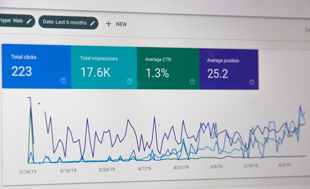
How Mobile SEO Affects Click Through Rates
Rankings are important, but they are not the only goal. Mobile SEO also affects how users interact with your search listing. Titles and meta descriptions must be compelling, relevant, and readable on smaller screens. If they are too long, they may be cut off, weakening the message.
Rich results can also improve visibility. Product ratings, FAQ results, event details, recipes, and other structured enhancements can make a listing stand out. On mobile, where screen space is limited, an enhanced result can capture attention faster than a plain blue link.
Measuring Mobile SEO Performance
To improve mobile rankings, you need to measure mobile performance separately from desktop performance. Look at mobile traffic, bounce rate, conversions, rankings, page speed, and user behavior. A page may perform well on desktop but poorly on mobile due to layout or speed issues.
Regular testing is essential. Check how pages look on different devices, browsers, and screen sizes. Review search performance reports to identify mobile queries that bring traffic. If users are finding your site on mobile but leaving quickly, that is a sign the page may not be meeting expectations.
The Future of Mobile Search
Mobile search will continue to evolve as voice assistants, visual search, artificial intelligence, and location-aware results become more common. Search engines are moving toward faster, more personalized, and more context-driven experiences. Websites that are flexible, fast, and user-focused will be better prepared for these changes.
The core principle will remain the same: help mobile users get what they need with as little friction as possible. If your website answers questions clearly, loads quickly, and works smoothly on any device, it has a stronger chance of earning and keeping good rankings.
Mobile SEO is not a single task to complete once. It is an ongoing process of improving speed, usability, content, and technical performance. As mobile search continues to dominate, the websites that treat mobile experience as a priority will have a clear advantage in search results.

