
A championship poster does more than announce a date, location, and matchup. It captures the energy of a season, the pride of a team, and the anticipation of fans who want to feel that something unforgettable is about to happen. Whether you are promoting a school tournament, a regional finals event, a boxing title night, an esports grand championship, or a community sports festival, the right poster can turn a simple announcement into a rallying cry.
TLDR: A great championship poster should feel bold, emotional, and instantly understandable. Use strong typography, team colors, dynamic imagery, and a clear visual hierarchy to guide the viewer from the headline to the event details. The best designs balance excitement with readability, making fans want to attend, watch, share, and celebrate.
Why Championship Posters Matter
Championships are built around emotion: rivalry, pressure, legacy, teamwork, and victory. A poster is often the first visual moment where that emotion becomes real. It tells fans, athletes, sponsors, and the community, this is the big one. In a crowded digital world, a memorable poster can help an event stand out on social media, school noticeboards, arena walls, storefront windows, and email campaigns.
A well-designed championship poster also creates a sense of importance. Regular-season games can be promoted with simple graphics, but a championship deserves something more dramatic. Think of it as the visual equivalent of stadium lights turning on, music rising, and the crowd standing up. The design should suggest that the stakes are high and that every moment matters.
Start With the Story of the Event
Before choosing fonts or colors, ask what the poster should communicate. Is it a fierce rivalry between two historic teams? Is it the final match of an underdog season? Is it a community event centered on youth sports and family fun? The story should shape every design decision.
For example, a championship poster for a high school basketball final might focus on team pride, school colors, and player silhouettes. A poster for a mixed martial arts title fight might use intense lighting, gritty textures, and close-up portraits. An esports championship could lean into neon colors, digital effects, and futuristic type. The strongest posters do not use style randomly; they use style to support the event’s personality.
Use a Powerful Visual Hierarchy
Visual hierarchy is the order in which people notice information. On a championship poster, the most important element should usually be the event title or matchup. After that, viewers should quickly find the date, venue, time, ticket information, and participating teams or athletes.
A strong hierarchy keeps the design exciting without making it confusing. If everything is large, bold, and colorful, nothing stands out. Instead, create contrast between your main headline and supporting details. Use size, spacing, color, and placement to guide the eye.
- Main headline: Make this the biggest and most dramatic text on the poster.
- Teams or athletes: Feature names, logos, portraits, or mascots prominently.
- Event details: Keep date, time, and venue easy to read from a distance.
- Call to action: Add a simple phrase such as Get Tickets, Watch Live, or Join the Finals.
- Sponsors and partners: Place these clearly but avoid letting them overpower the main message.
Choose Typography That Feels Like Competition
Typography can make a poster feel fast, tough, elegant, historic, or futuristic. Sports posters often work well with bold condensed fonts, slab serifs, collegiate lettering, angular display fonts, and clean sans serif typefaces. The key is to choose fonts that are not only stylish but also readable.
A championship poster is often viewed quickly: someone scrolls past it, walks by it, or sees it from across a gymnasium. If the type is too decorative, the message can be lost. Use expressive typography for the headline, then pair it with simpler text for details. This combination creates personality while preserving clarity.
For a classic football or baseball championship, you might use varsity-inspired lettering with thick outlines. For a track, cycling, or racing event, a slanted italic typeface can suggest speed. For combat sports, heavy block letters can communicate impact. For a dance, cheer, or gymnastics championship, a refined but energetic font may feel more appropriate.
Make Color Work Hard
Color is one of the fastest ways to signal identity and emotion. Team colors are often the natural starting point, especially when two sides are competing. A poster might split the background into two opposing color fields, place teams on opposite sides, or use a central burst of light where the championship title appears.
However, color should be managed carefully. Too many colors can make a poster look chaotic. A practical approach is to choose one dominant color, one secondary color, and one accent color. The accent color can be used for important details such as the date, ticket link, or trophy graphic.
Common color moods include:
- Gold and black: Prestige, victory, luxury, and high stakes.
- Red and navy: Intensity, tradition, and competitive spirit.
- Electric blue and purple: Modern energy, esports, nightlife, and digital events.
- Green and white: Freshness, community, outdoor sports, and school pride.
- Silver and charcoal: Professionalism, strength, and sleek championship branding.
Feature Athletes, Teams, or Symbols
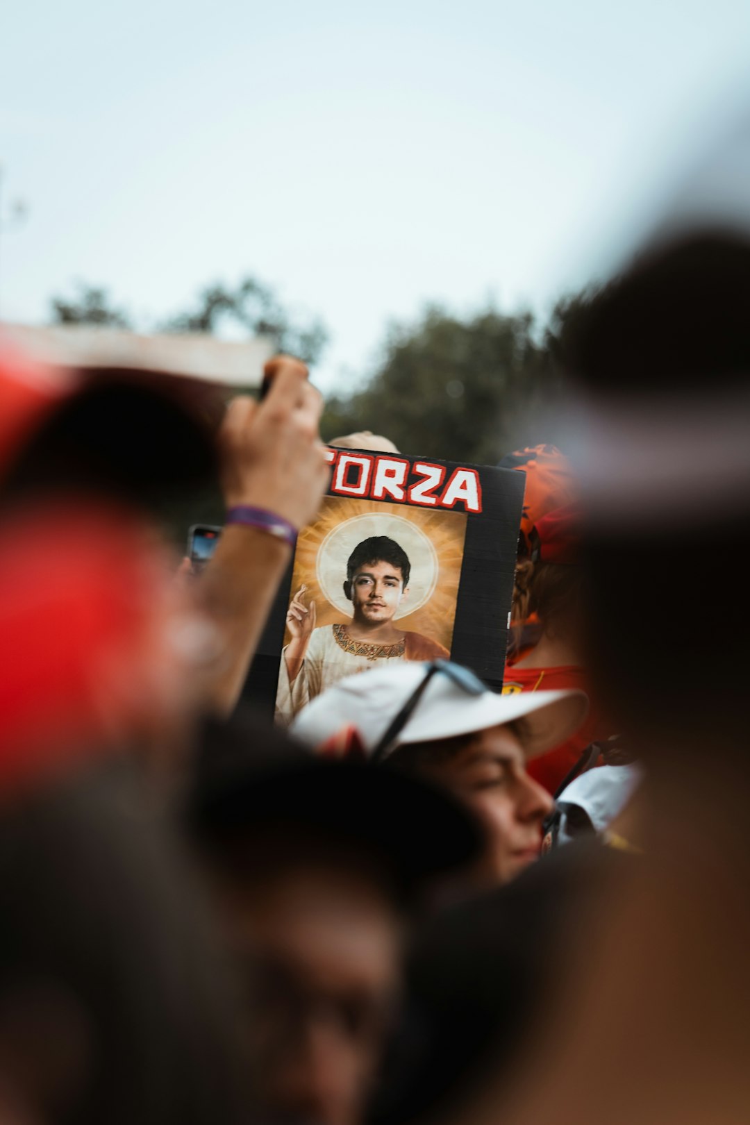
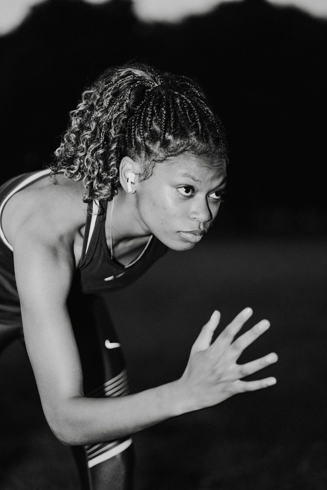
Human faces create immediate emotional connection. If you have access to strong athlete photography, use it. A determined expression, a mid-action leap, a runner exploding from the starting line, or a goalkeeper diving across the frame can bring a poster to life. When photographing or selecting images, look for movement, tension, and focus.
If athlete images are not available, symbols can work just as well. Trophies, rings, stadium lights, helmets, balls, courts, tracks, crests, and mascots all help communicate the event. You can also use silhouettes to avoid needing perfect photography while still creating drama.
One effective technique is to combine a central trophy with action imagery in the background. Another is to place rival athletes face to face, separated by the event title. This format instantly communicates competition and is especially effective for finals, title fights, and one-on-one matchups.
Create Energy With Composition
Championship posters should rarely feel static. Even if the layout is clean, the composition should suggest movement and anticipation. Diagonal lines, motion blur, light streaks, smoke, particles, and layered textures can all add energy. These elements should enhance the design rather than distract from the information.
A centered composition can feel official and prestigious, especially when a trophy or title is the main focus. A diagonal composition can feel faster and more aggressive, ideal for racing, basketball, soccer, or action sports. A split composition works well for head-to-head matchups, while a collage composition can celebrate multiple teams, divisions, or event categories.
Spacing is equally important. It can be tempting to fill every corner with logos, slogans, photos, and effects, but empty space gives the poster room to breathe. Strategic negative space can make the headline feel bigger and the event feel more premium.
Design Ideas for Different Championship Events
Different sports and events call for different visual approaches. While the fundamentals remain the same, the atmosphere should match the audience and culture of the competition.
- Basketball championship: Use hardwood textures, rim silhouettes, spotlight effects, and bold urban typography. Action shots of players dunking, shooting, or defending can create instant excitement.
- Soccer final: Feature stadium lights, grass textures, team scarves, flags, or a dramatic ball image. A wide arena-style composition can suggest global scale and crowd energy.
- Football title game: Combine helmets, turf, yard lines, smoke, and aggressive type. Strong contrast and angular shapes can make the design feel powerful.
- Track and field championship: Use motion lines, lane markings, finish-line tape, and dynamic runner silhouettes. Bright accent colors can emphasize speed and achievement.
- Esports championship: Use neon glows, digital grids, character-inspired lighting, and futuristic text. Make sure the design feels high-tech but still readable on small screens.
- Martial arts or boxing event: Focus on dramatic portraits, dark backgrounds, metallic titles, and strong red or gold accents. Face-off layouts are especially effective.
- Cheer or dance finals: Use energetic poses, stage lights, spark effects, and vibrant colors. The tone can be competitive, celebratory, and stylish at the same time.
Do Not Forget Practical Information
A poster can look incredible and still fail if viewers cannot find the basics. Always include the essential event details in a clear location. These details should not be hidden in tiny text or buried under visual effects.
- Event name
- Date and time
- Venue or streaming platform
- Participating teams, athletes, or divisions
- Ticket or registration information
- Website, QR code, or social media handle
- Sponsor logos, if required
If you include a QR code, give it enough white space so it scans easily. If the poster will be printed, test readability at the actual size. If it will be used online, preview it on a phone screen. Many championship posters fail because they are designed at full size but viewed mostly as small social media thumbnails.
Add Texture, Depth, and Finishing Details
Textures can make a championship poster feel more tactile and memorable. Grunge textures can suit intense sports. Metallic gradients can make titles look prestigious. Paper grain can create a vintage tournament feel. Light flares and smoke can add arena atmosphere. The best finishing details support the theme without overwhelming the message.
Depth can also be created through layering. Place background textures behind athletes, add shadows beneath text, overlap images with large typography, or use glowing outlines to separate figures from the background. These small techniques make the poster feel more professional and cinematic.
Print and Digital Considerations
A championship poster often needs to work in multiple formats: printed flyers, large banners, social media posts, email graphics, and digital screens. Design with flexibility in mind. A vertical poster may work well for walls and stories, while a square or horizontal version may be better for social feeds and website headers.
For print, use high-resolution images and make sure text is not too close to the edge. For digital use, keep the file size manageable and ensure the most important information remains legible on mobile devices. If the event has multiple promotional phases, create a consistent visual system: teaser poster, full announcement, matchup graphic, countdown post, and final reminder.
Common Mistakes to Avoid
Even energetic championship designs can run into problems. Avoid using too many fonts, cluttering the layout, stretching logos, placing text over busy backgrounds, or making sponsor logos larger than the event title. Also avoid relying only on effects. Smoke, sparks, flames, and glows can be exciting, but they cannot replace a strong layout and clear message.
Another common mistake is ignoring the audience. A youth sports championship poster should not necessarily look like a professional boxing promotion. A corporate golf tournament should not feel like a streetball event unless that is part of the intended brand. Match the design to the people who will see it and the emotions you want them to feel.
Final Thoughts
A championship poster should feel like an invitation to witness something important. It should honor the athletes, excite the fans, and communicate the details without confusion. When strong imagery, bold typography, smart color choices, and clear information come together, the result is more than an advertisement. It becomes a symbol of the event itself.
Whether your championship is taking place in a packed stadium, a school gym, a local park, a theater, or an online arena, the poster sets the tone. Make it confident, make it readable, and make it worthy of the moment. After all, championships are remembered for the performances on the field, court, stage, or screen, but the right poster can help build the anticipation that makes those performances feel legendary.