
Use Figma if your dating app is still being shaped. Use Framer if you want to turn a polished dating app template into a clickable, web-ready experience fast. Figma is better for teams, flows, design systems, and messy early ideas. Framer is better when your design needs to feel alive and close to a real product.
TLDR: Pick Figma for planning screens like swipe cards, chat, filters, onboarding, and profile setup. Pick Framer when you want a landing page, prototype, or live preview that feels like an app. For example, a small dating startup with 3 people may build 35 screens in Figma first, then move 8 key screens into Framer for investor demos. In one simple workflow, that can cut demo prep time by around 30%.
Why this choice matters
A dating app looks simple.
It is not.
You need profile cards. Match screens. Chat states. Photo uploads. Safety prompts. Premium upsells. Empty states. Error states. Awkward “no matches yet” screens. The small stuff adds up.
That is why choosing the right design tool matters. A dating app template can save weeks. But only if the tool fits the job.
Figma and Framer both help you design. They just solve different pains.

Figma: best for building the full dating app system
Figma is the safer pick for most dating app templates. It gives you space to think. You can map every screen. You can test 12 versions of a profile card. You can build reusable buttons, icons, forms, and chat bubbles.
That matters because dating apps repeat patterns all over the place.
- Profile cards show photos, age, distance, interests, and prompts.
- Chat screens need message states, typing states, and read receipts.
- Onboarding asks for name, photos, gender, interests, and location.
- Match screens need excitement without looking cheesy.
- Settings need privacy, safety, billing, and blocked users.
In Figma, you can turn these into components. Change one “Like” button, and it updates everywhere. Nice. Very nice.
It is also great for feedback. A founder can comment on a screen. A developer can inspect spacing. A designer can update the flow. Nobody has to send files named final final real final v9. Thank goodness.
Where Figma gets annoying
Figma prototypes are useful. But they can feel flat.
You can fake swipes. You can link screens. You can add simple transitions. Still, a dating app is full of motion. Cards slide. Photos expand. Messages pop. Buttons react. Premium walls appear at just the wrong moment. Figma can show the idea, but it may not feel real enough.
Honestly, it feels like you spend 20 extra seconds setting up tiny prototype links that should have taken 5. Not a disaster. Just mildly irritating.
Also, if you want to publish a landing page or a working web-style demo, Figma is not built for that. You will need another tool.
Framer: best for interactive demos and launch pages
Framer feels closer to a live product. It is great when you want your dating app template to move, react, and impress.
Say you have a concept called CrushClub. You want to show investors how users join, swipe, match, and start chatting. Framer can make that feel slick. You can add motion. You can build a landing page. You can publish it. You can share a real link.
That is a big win.
Framer is also strong for marketing pages. Dating apps need those. Before users download anything, they need trust. You may need:
- A bold hero section.
- App screenshots.
- Safety feature blocks.
- Pricing sections.
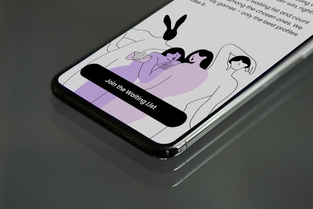
- Waitlist forms.
- Testimonials from beta users.
Framer handles this well. It gives your template more polish. The app can feel less like a static design and more like something people can imagine using.
Where Framer can frustrate you
Framer is not as comfortable for big app systems.
If you are planning 60 mobile screens, many edge cases, and a full design kit, Figma is calmer. Framer can do a lot, but it is easier to get tangled when the project grows.
The catch is simple. Framer shines when things are polished. Figma shines when things are still messy.
Dating apps stay messy for a while.
Your matching logic may change. Your onboarding may shrink from 9 steps to 5. Your premium screen may need three price tests. Your chat design may need new safety warnings. Figma handles that kind of chaos better.
Dating app template features to design first
Before picking a tool, list your core screens. This saves pain later.
For a basic dating app template, start with:
- Welcome screen with login and sign up.
- Onboarding flow for photos, age, interests, and goals.
- Profile setup with prompts and preview.
- Swipe screen with like, pass, super like, and report.
- Match screen with a fun “you matched” moment.
- Chat screen with text, photos, and safety controls.
- Search filters for distance, age, interests, and intent.
- Premium screen for boosts, likes, and subscriptions.
- Settings for privacy, account, and blocked users.
If that list already feels big, go with Figma first. If you only need 5 screens for a sales demo, Framer may be enough.
Figma vs Framer: quick comparison
| Need | Better Choice | Why |
|---|---|---|
| Full dating app UI kit | Figma | Components, variants, and team feedback are easier. |
| Clickable investor demo | Framer | Motion and publishing feel stronger. |
| Developer handoff | Figma | Specs, spacing, and assets are simple to inspect. |
| Landing page | Framer | You can design and publish from one place. |
| Early product planning | Figma | It is better for messy flows and quick edits. |
The best workflow: use both
You do not have to pick only one.
For many teams, the best answer is Figma first, Framer second.
Start in Figma. Build the dating app template. Create the components. Test the user flow. Show all boring but vital screens, including errors and empty states.
Then move the best parts into Framer. Animate the swipe flow. Build the public landing page. Make a demo that feels fun.
This combo works well for startups. It also works for solo designers who want portfolio work that looks real. A static app template is fine. A living demo is better.
Image not found in postmetaWhich one should you choose?
Choose Figma if:
- You are designing the full app.
- You care about reusable UI parts.
- You need comments from founders, developers, or clients.
- You are still changing the product idea.
- You want clean developer handoff.
Choose Framer if:
- You need an impressive prototype.
- You want to publish a landing page.
- You care about smooth motion.
- You have a smaller set of screens.
- You are pitching the idea soon.
Final verdict
Figma is the better main tool for a dating app template. It gives you structure. It keeps large screen sets under control. It makes feedback less painful.
Framer is the better tool for presentation. It adds motion, polish, and a live link people can click. That matters when you need to sell the idea.
So here is the simple rule.
Design the dating app in Figma. Show it off in Framer.
That way, your app does not just look good. It feels closer to real. And that first swipe? It might actually make someone smile.

